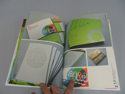
I have used a watercolour stock for the cover, which allows the newsprint stock on the inside to standout more from the overall design, the contrast between the two stocks also makes the cover feel more individual and makes it standout from the rest of the design, which has allowed me to create another complex design for it without it contrasting with the complex grids used inside.

the two different types of french folds have allowed me to use perfect bind to combine the pages of the book in the most effective way, as use on the Karel Martens book Counter Print.


Pages 02 and 03, show the first french fold page, however to make the design more interesting i have designed the book so after 04 and 06 the pages can be lifted to reveal the inside pages and a large logo of my Yorkshire rose. as shown bellow. This would be tricky to produce in masses however if the book is produced in a limited run this would possible, it also brings enthesis on the tactile side of specialist print process, this will bring across that the book is different and there for unique, which will keep the viewer interested.


I have used the colour plan Barry in the book this will again pace the flow of the book and keep the viewers attention, this is a divider page to a new section of french fold leafs.


this section is on my experience at Generation Press inside the french leaf folds i have included pictures and comments from twitter, which were posted by Paul throughout the dates of my visit, this is again another section of the book which is not apparent and obvious at the Begining but its a subtle section, which will make the book feel more special and considered in terms of design.


No comments:
Post a Comment